Author(s): Shriyash Shete
This paper explores enhancing the smartphone lock screen notification experience to promote digital well-being. It introduces a novel categorization system for notifications, aiming to reduce user overwhelm and improve interaction efficiency. The study also incorporates Samsung’s Bixby Routines, emphasizing the importance of user-centric design. Future implications regarding the security and privacy challenges of AI-powered categorization and summarization are discussed, highlighting the need for secure data handling and assessing AI’s effectiveness in this context. The research underscores the significance of thoughtful design in technology for a healthier digital lifestyle.
In today’s society, smartphones are essential for accessing and disseminating information. When users of current smart- phones turn on the display of the device, they are usually greeted with a lock screen, consisting of a large clock and a list of push notifications below it. They constantly deliver a myriad of notifications from various applications. The number of notifications exploded in the last couple of years. Mobile devices began to be connected to the Internet around the clock, and app stores allowed all kinds of applications and services to run on devices. Pielot et al. found that, on average, users get more than 50 notifications per day [1,2].
Smartphone notifications can be considered a curse and a blessing. They have a legitimate purpose, as they promise to inform us about potentially relevant information, such as in-coming messages/emails, calendar reminders, or developments in public and social media. From a developer’s perspective, a notification can be considered successful if a user opens and engages with the application. Dismissing a notification i.e., “swiping it away” would represent a negative result [1,3].
Managing an excessive number of notifications on smart-phones can lead to stress and decreased productivity. These notifications, while intended to keep users informed and connected, often result in unwanted interruptions and distractions, negatively impacting ongoing tasks and overall well-being. Research indicates that the constant flow of notifications not only disrupts work performance but also induces negative emotions such as annoyance, stress, and anxiety. The challenge lies in balancing the delivery of important information without overwhelming the user, as excessive notifications can lead to missed opportunities and vital information, creating a para-dox of being inundated with information yet under-informed [1,2,4].
In this paper, we aim to answer the following research question: RQ: How might we re-organize lock screen notifications to help users quickly prioritize, control and consume information assuring digital well-being?
This paper focuses on the Samsung Galaxy S20 phone for the case study. All other Android phones are out of scope.
In the following, we briefly provide background information on the existing adjacent features for notification management offered by Samsung. Subsequently, we provide an overview of related work on mobile notifications.
Modern mobile operating systems support notifications as a mechanism to present a concise piece of information. Most mobile applications today employ notifications for a variety of reasons through different modalities. For example, apps like calendar use notifications to alert users about upcoming events, gaming apps use notifications to increase users’ engagement with their apps, and email apps let users take quick actions via notifications to reply or archive a new email. Since notifications are designed to be compact and do not require users to launch the full app, notifications have emerged as a popular mechanism to gain user attention [2].
In 2017, Samsung launched Bixby-a virtual assistant that makes it easier to use the phone, giving users more time to focus on what matters the most. Bixby learns, evolves and adapts to what users like to do, working alongside their favorite apps and services to help them get more done. Bixby remembers how users interactwith it, to give users a more individualized experience. The more one uses Bixby, the better it becomes at adjusting to their needs [5].
Bixby Routines use machine intelligence to learn user’s specific usage patterns and preferences. Bixby can then use this to automatically adjust the settings, control apps, and optimize the battery. Users can also manually set up routines based on where you are and what you’re doing. For example, they can create a ‘good night’ routine so that at a certain time the phone turns on mute, night mode comes on, and their lock screen shortcuts change [6,7].
Based on Android’s operating system’s digital well-being feature guidelines, Samsung Galaxy phones offer a variety of relevant features. ‘Focus Mode’ allows users to pause or silence notifications from selected applications temporarily helping users to focus on the task at hand. With the ‘App Timer’, users can limit excessive usage of an application by being notified of actual time spent on an application against the target usage time. ‘Wind Down’ was developed to reduce eye strain before going to sleep and improve sleep quality. Once the user sets the bedtime schedule, the screen will fade to greyscale as the time to sleep approaches to further protect eyes and encourage users to refrain from using their phones before sleep [8].
There have been several prior efforts to address some of the issues related to notification management. However, they have focused on addressing the question of “when” to present a notification such that it causes minimum disruption (i.e., selecting opportune moments to notify users), and results in high user responsiveness (i.e., how fast users react to a notification). There has not been enough research on addressing the specific question of “how” we can enhance the current notification system user interface of the lock screen of mobile phones using a design thinking approach [2].
Challenges with the Current Notification System To understand the problem better, we investigated the existing user behavior by interviewing 10 Samsung Galaxy users and derived the following pain points:
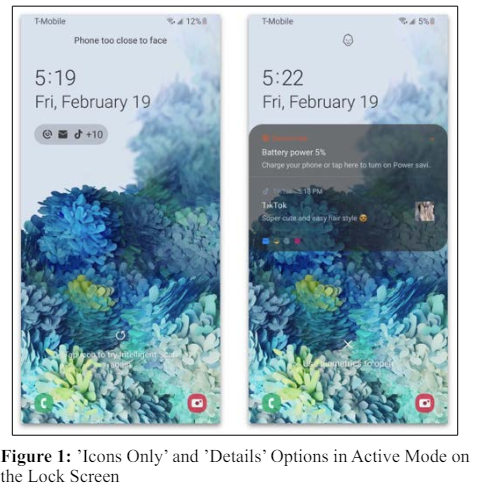
One of the participants mentioned “I feel like I’m missing out on the important information. So I keep notifications on but I can’t view them all on the lock screen like an iPhone...” We found that there are only two options under ‘Notification Settings’ to view lock screen notifications. The ‘Icons Only’ option does not allow users to see any details without unlocking the phone. The ‘Details’ option shows detailed information in an expanded drawer only for a couple of the latest notifications, with other notifications stacked and represented by just the app icon in a single row at the bottom of the drawer. (See Figure 1)
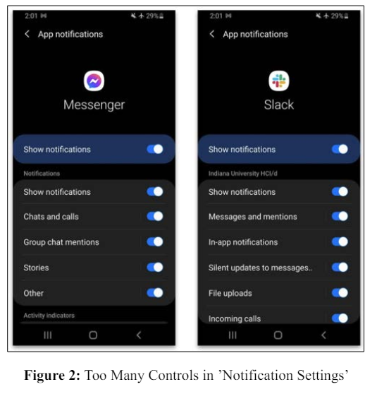
Managing every application’s notifications individually inside the Settings panel is a very tedious process. (See Figure 2) When asked about this, one participant reacted “That’s way too many options. . . I wish I could control them easily.” It aligns with the Hick’s law of user experience that argues the time it takes to make a decision increases with the number and complexity of choices.
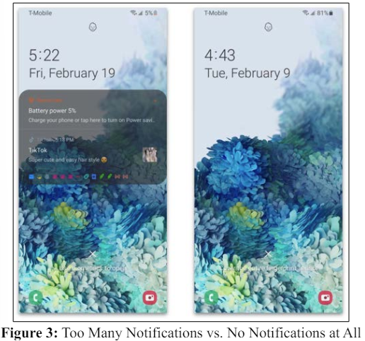
Users get overwhelmed with the number of notifications and on the other hand, they have a fear of missing out or being underinformed after turning them off completely. (See Figure 3) One of the participants mentioned “...That day I got so frustrated and turned off all WhatsApp notifications permanently. But it didn’t help. Because I couldn’t turn off the anticipation and urge to see the messages for too long. . .
While notifications originating from messengers are mostly considered useful, social media, entertainment, shop- ping, or news apps generate many unwanted notifications. People cannot prioritize the notifications from the same app according to how informative they are. For instance, it is challenging to filter out annoying notifications (e.g., advertisements) while maintaining only the informative ones sent from a messenger app.
Although Samsung and Android OS have introduced new features such as Focus Mode, App Timers, Wind Down, Screen Time and AI-powered Bixby Routines to improve users’ digital well-being, not much has been done for notifications viewed on the lock screen. (See Figure 4 (a)-(e)).
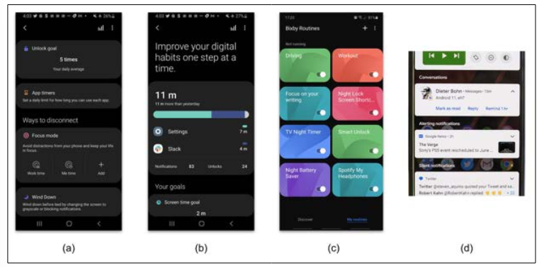
Research suggests that users want to feel less overwhelmed with the notifications and should be able to manage them efficiently. We propose 4 main categories of notifications based on user’s usage, preferences and priorities: 1. Bixby routine notifications, 2. Conversations, 3. Alerting notifications and 4. Silent notifications. (See Figure 5) The categories can be represented with icons that are consistent with the ‘Icons only’ option users are familiar with as shown in the diagram above.
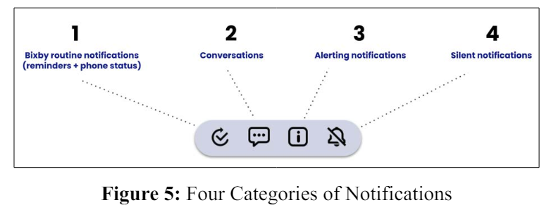
There shouldn’t be any badges or numbers so they don’t feel overwhelmed or distracted. Thus, we proposed a cleaner and efficient way to categorize notifications avoiding visual noise.
Bixby Routines notifications should be of the highest priority and hence displayed first, as these are the tasks and goals users have set for themselves. So the notification management system caters to the needs of users and helps them so that they can quickly get to what’s most important to them.
Users struggle to manage their conversations across multiple applications and yet they don’t want important personal messages to go unnoticed. The conversations tab can help them avoid unnecessary delays in communication.
In this category, users can review notifications that are informative but don’t require immediate attention or action. These could be grouped based on applications. For example, all Twitter notifications can be grouped in chronological order under a single bunch to accommodate other applications. Users can prioritize the app that interests them the most and decide what to read from the long scrollable list.
The lowest priority notifications are silent notifications that can be system-generated or promotional. For example, this category can contain notifications from the Google Play Store about app updates or some advertisements from utility applications. Users can scan these at their leisure and clear them individually by swiping left or right or all at once by pressing the ‘Clear all’ button.
Here we describe interactions of the new notifications system with a usage scenario of Emily, a manager at an IT company who works remotely and owns a Samsung Galaxy S20. Emily receives about a hundred notifications per day from various applications on her phone. Her goal is to minimize her digital distractions, stay focused and attain maximum productivity. So she uses the Bixby Routines feature to set goals and plan her daily tasks. She likes the Bixby Routines feature but with that, she wants to manage other app notifications efficiently so she can stay on top of her personal goals and important activities. Emily updates her phone and discovers a new option of ‘Prioritize’ under Notification Settings (See Figure 6).
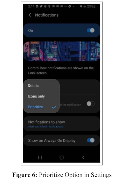
She selects the ‘Prioritize’ option and discovers some changes to the organization of her lock screen notifications. She now notices a clear breakdown of notifications into four preset categories based on her personal goals and priorities. Following are the four interaction use cases that Emily will experience:
How would Emily know which category the latest notification went into?
The latest notification appears with a small black dot below the icons, indicating the category it belongs to. If the notification is not attended for five seconds, the notification will disappear and the lock screen will go back to its default state (See Figure 7).
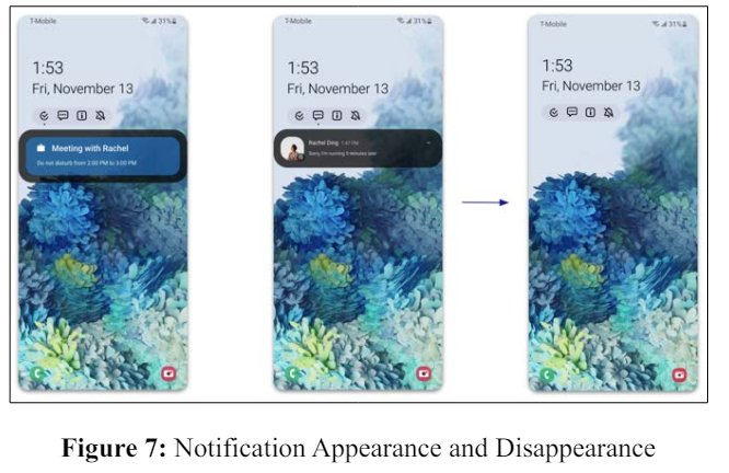
How would the lock screen be displayed if there are no notifications in any of the four categories?
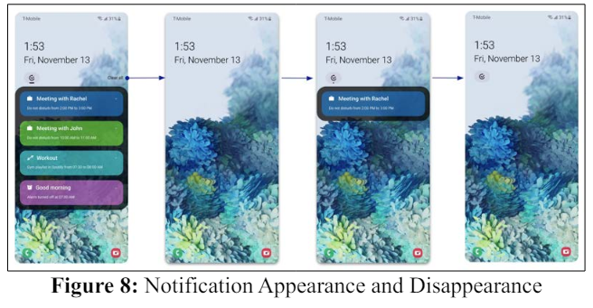
How can Emily prioritize and control a notification within a specific category?
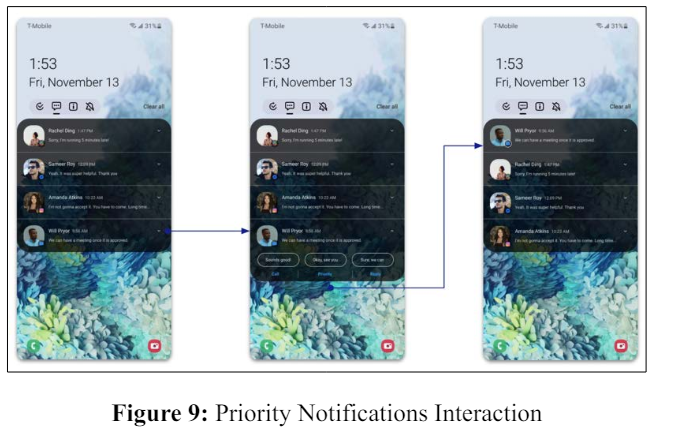
Users can prioritize their conversations by pinning them to the top of the category. Tapping on the chevron will expand a notification and display additional quick action buttons such as ‘Call’, ‘Priority’ and ‘Reply’ (See Figure 9).
How can Emily move notifications between the categories?
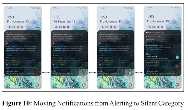
Users can quickly change the alert notifications to silent by left drag interactions and tapping on the bell icon, without having to go through the settings menu. (See Figure 10)
In conclusion, this research on enhancing the smartphone lock screen notifications experience underscores the critical balance between connectivity and digital well-being. The study introduces an innovative approach to categorizing notifications, aiming to reduce the overwhelm of users and pro- mote a more efficient and personalized interaction with their smartphones. By segmenting notifications into four distinct categories and redefining user interaction patterns, the paper presents a forward-thinking solution to the persistent challenge of notification overload. This approach not only respects the user’s time and attention but also contributes to a healthier digital lifestyle. The findings underscore the importance of thoughtful design in technology, highlighting the role of smart systems like Bixby Routines in fostering a more manageable and user-centric digital environment.
Moreover, it’s pertinent to acknowledge the future implications and limitations of the proposed solutions. The aspects of security and privacy are paramount, especially when dealing with AIpowered categorization and summarization of notifications. Ensuring that user data is handled securely and privately should be a core component of any further development. Additionally, the effectiveness and accuracy of AI in categorizing and summarizing notifications pose significant challenges and opportunities for future research and development in this domain. This approach, while promising, must be carefully balanced with user privacy and security considerations.
We hope to conduct a more in-depth analysis of user interactions with these reorganized notifications, with thorough usability testing with a broader range of user demographics and scenarios. Additionally, we would like to study the long- term impacts of these changes on the digital well-being of users.
