Author(s): Shriyash Shete
This paper addresses the critical need for enhancing the urban commuting experience in Pune, India, amidst its rapid population growth and urbanization. Focused on the upcoming Pune Metro, the study pioneers a user-centered information system aimed at streamlining the public transit experience. We present a novel design of a transit map, employing an alphanumeric box and grid layout that significantly improves legibility and navigational ease for commuters. Complementing this, the paper details the development of intuitive, user-friendly interfaces for both self-service kiosks and a comprehensive mobile application. These designs are the result of extensive field research and user interviews, ensuring they meet the diverse needs of the local commuter base. The integration of digital and physical information systems forms a core part of our strategy, aiming to provide a cohesive and seamless transit experience. The paper emphasizes the importance of user-centric design in public transportation systems and sets a benchmark for future urban transit
solutions. Furthermore, it outlines plans for future usability studies to validate and refine these solutions, ensuring they adapt to evolving commuter needs and preferences. Through this work, we contribute to the broader discourse on enhancing urban mobility and setting new standards in public transit system design.
Pune is the second largest city in Maharashtra state in India and the ninth largest city in the country. According to World Population Review, with the current 2.57% annual growth rate of the city’s population, it is estimated that Pune’s population will be around 9 million in 2035. These population estimates and projections come from the latest revision of the UN World Urbanization Prospects. These estimates represent the Urban agglomeration of Pune, which typically includes Pune’s population in addition to adjacent suburban areas. Pune is also emerging as a manufacturing and IT center with the 6th highest per capita income in India [1,2].
Pune is known to have one of the worst traffic congestion in the region. Today, the road traffic condition has been so worsening, that the wide coverage of and development of public transit should be prioritized. Currently, public trans- port in Pune mainly includes Buses, Autorickshaws (Three-wheelers) and Taxis/Cabs. Over the past decades, the existing modes of public transport have been upgraded to be modern and convenient; however, many people in Pune are driving their private vehicles instead of using public transport, leading to an ever-increasing number of private vehicle ownerships and road accidents which have become a significant concern for authorities. In parallel, rapid industrialization and intense commercial developments in the past decades have resulted in a steep rise in travel demand, putting Pune’s transport infrastructure under stress. With the projected increase in the city’s population, strengthening and augmenting the existing transport infrastructure has assumed urgency [3,4].
Pune Metro is coming up as a radical transformation of the public transport system in the city and also the visionary flagship project of the current government under the smart city initiative. There have been several public transit construction projects planned to be completed in the next 5 years. As this change in transport infrastructure presents a huge pool of research and design opportunities, we took some preemptive steps and leveraged the user-centric digital design approach to envision a seamless travel experience for new metro commuters [3].
In this paper, we describe the design process we followed to design and envision a user-friendly, real-time passenger information system of a physical map, smartphone application, and ticketing kiosk for all future Pune Metro commuters. Throughout the process, the research question addressed is as follows: How might we make pre-emptive design decisions to make the upcoming Pune Metro a reliable, safe and commuter- friendly transit system?
Now recognized across the world, the London Tube map was originally designed by the Underground electrical draughtsman, Harry Beck in 1933. Rather than emphasizing distance and geographical accuracy, like other maps, Beck based his on the circuit diagrams he drew for his day job; stripping the sprawling Tube network down to a neat diagram of colored, criss-crossing lines [5,6].
Prof. Rane recommends using alphanumeric box and grid layouts through his Bangalore (Namma) Metro, Pune Bus Map and Mumbai Railmap projects to improve legibility and reduce search time for commuters. He claims that making it schematic, ergonomic and useful with minimum alteration in geography can help form a mental model to make informed decisions [5].
In the realm of Information and Communication Technology (ICT), kiosks are electronic devices or computer terminals located in public areas for self-service information access. They store data and provide interactive features for user engagement, eliminating the need for human assistance. The first self-service kiosk, “The Plato Hotline,” was created by Murray Lappe at the University of Illinois, offering various information like bus schedules and course details [7-9].
Kiosks comprise three main components: hardware, soft- ware, and the application. The hardware typically resembles an ATM machine with a touchscreen interface and may include various input/output devices like trackballs, buttons, keyboards, card readers, and printers, tailored to specific needs. The software enables efficient and user-friendly interaction, varying based on the kiosk’s application, whether it’s for ticketing, health information, or other services. This customizable software is crucial in facilitating the intended use of the kiosk [7-9].
We interviewed 8 target users whose commute regularly consisted of public transit including a metro commute in other Indian cities. Unstructured interview questions consisted of four parts: modes of transportation, itinerary planning process, everyday issues of public transit, and applications and tools used to assist traveling via public transit. Each user interview session lasted for about 30 minutes on average.
Based on interviews, we drafted a user journey flow (See Figure 1) and derived two key user personas (See Figure 2) to summarize the existing user behaviors and identify the opportunities for potential digital assistance.
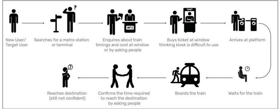
Figure 1: User Journey
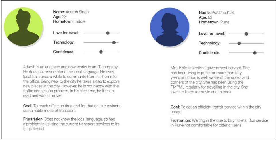
Figure 2: User Persona
Based on research insights, discussions with frequent local train commuters in Pune and Mumbai, and our visit to Jaipur Metro, we gained some valuable insights that helped us in the ideation phase. In this section, we describe three solutions we designed using iterative design and feedback process:
Maps play a critical role in providing travel-related information to help commuters navigate and guide them toward informed decision-making before the journey. Majority of the people use Google Maps however, Google Maps is not yet updated with the upcoming Pune Metro routes. There is a large population especially older people who prefer using printed maps over digital smartphone applications. Moreover, the existing Pune Metro map published on the website comes from the official technical project document which is not very legible and well designed.
The proposed schematic map uses four visually distinct colors to display three metro lines and simplifies the process of finding stations. The green line is halfway underground and the other half is an elevated route hence both are indicated by two different shades of green. It will help users remember lines by their colors instead of numbers even if there is a more complex metro line structure in the future.
As shown in the high-fidelity design (See Figure 3), we implemented the 4 X 4 box grid and index layout recommended by the study, to guide users’ eyes and improve the readability of the map [5]. The map is divided into 16 boxes. If a user knows the station name they wish to arrive at but doesn’t know which metro line it comes on, they can quickly look up the station name in the Index section, check the associated box no. and line color put in front of it to find the precise location on the map. Box 1 shows all instructions on how to use the map. Box 13 contains a Legend that can help users reduce the cognitive load while reading the map. It includes Line colors and numbers, a Depot icon, Station Markers and a Terminal Station icon where three lines intersect.
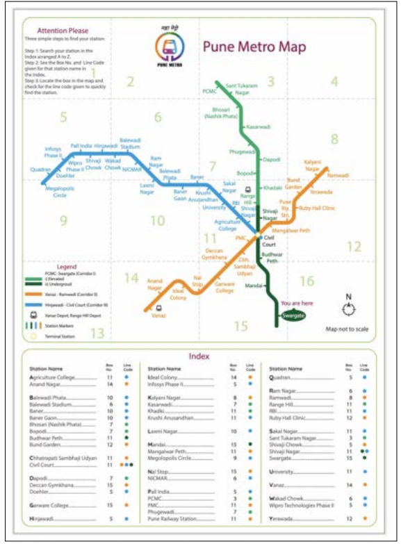
Figure 3: Pune Metro Map
Studies have listed the advantages of using self-service kiosks. Self-service kiosks reduce the extra burden and work- load of the staff. It reduces queues and waiting times at the service desks. It can be used in a common public place and metro stations as a 24/7 information facility. Passengers with no computer literacy can use it. The use of kiosks facilitates a sense of ownership and choice. It makes the transaction fast with textual instructions and visuals. The multi-language function on kiosks can help users use the instructions in any of the languages they are comfortable with.
We studied several existing ticket vending machines and self- service kiosks online as well as in person and found out that even though there are several advantages of using kiosks, their interface needs to be easy to use. We propose a kiosk design that has an interface as simple and intuitive as possible. The objective is to reduce the ticket vending time to make it more preferable over the manual ticket booking at the window with a long queue.
The kiosk, as shown in Figure 4, will have a simple and inviting screen with three language options that local commuters speak and understand. Upon selecting the language, they will be presented with a menu from which they can select whether they want to buy a ticket, check the ticket fare chart, or whether they want to view the map. Selection will take them to the respective screens and flows.
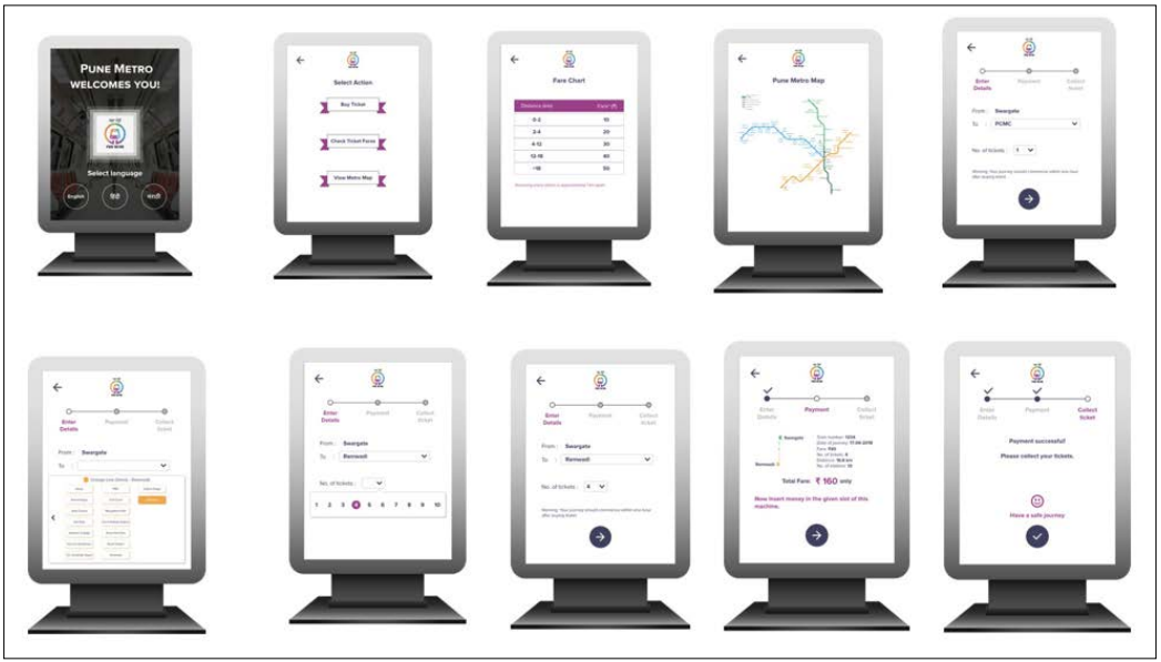
Figure 4: Self-Service Kiosk Interface
When a user taps on the ‘Buy a Ticket’ button, a 3-step wizard will be presented asking for the destination and number of tickets as a user input to calculate the total fare and present the payment method in the second step. Lastly, once the payment is successful it can indicate the status with a clear text and the user can collect the printed tickets from the machine slot. Similarly, tapping on ‘Check Ticket Fare’ will show a fare chart with ticket prices and selecting the ‘View Metro Map’ button will display the digital version of the map on the screen for users to interact with.
We deliberately kept the font and button sizes bigger to improve readability, minimize human error and streamline step-by-step interactions with clear messaging.
Lastly, we propose a user-friendly mobile application for commuters who prefer to consume metro-related information on their smartphones (See Figure 5). Along with the ongoing journey details and metro map, this application can offer a variety of options to choose from such as train timetable, fare calculator, smartcard recharge and station details to keep tech- savvy users updated and informed. Thus, we designed very simple workflows assuming English as the default language of the mobile app. The objective is to keep the user informed about all the services offered at all stations and to make them aware of the metro line network and related updates.
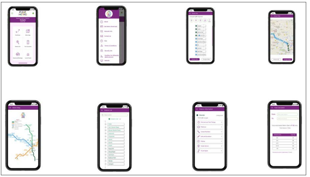
Figure 5: Pune Metro Mobile App
We hope that using this information system of Pune Metro map, self-service kiosk and smartphone application will help streamline the travel experience of new commuters. Today, every new traveler is introduced to the current Pune public transit in a very complicated manner. There will be an addition of three new metro rail lines and without an overview, confusion will prevail. They will be left with no other option but to ask the people around them for directions to navigate. Asking people can be a kind of risk (the authenticity of information).
Therefore the user will reconfirm by asking multiple people. Having an authentic map, kiosk and mobile app can resolve the problems people will face. Traveling from point A to B is one need, but to orient oneself in the city is another. With the proposed design, the traveler can have an overview of the Pune Metro network at a glance and avoid detours.
In conclusion, this paper presents a forward-thinking approach to enhancing the Pune Metro commuting experience through a user- centered information system. We introduced a user-friendly transit map with an innovative layout, designed intuitive interfaces for kiosks and mobile applications grounded in extensive user research, and effectively integrated digital and physical information systems to provide a seamless transit experience. These advancements not only meet the current needs of Pune’s diverse commuter base but also lay a foundational framework for future urban transit systems, underlining the importance of user-centric design in public transportation.
Looking ahead, we plan to conduct comprehensive usability studies to evaluate the effectiveness of these solutions in real- world scenarios. This will ensure continuous improvement and adaptation to evolving commuter needs, further enriching the overall satisfaction and efficiency of the Pune Metro system, and contributing to the progressive landscape of urban mobility solutions.