Author(s): Thomas Lingefjärd
In upper secondary school it is not obvious in which topic of mathematics and physics that graphical explorations in areas such as motion and velocity vs time belong. This article suggests a way of using dynamic graphical explorations in GeoGebra as a way to visualize concepts of motion and velocity vs time.
The subject mathematics seems important for many other subjects, including physics. The questions we ask in physics often need a mathematical translation to be graphically interpreted and transformed. Mathematics teachers learn physics when interacting with physical questions, questions from physics also give insights and discoveries in mathematical problems. In physics we often ask new questions that benefit from being modelled with mathematical tools. A scientific theory (in physics or in another science) is an isomorphism between physical reality and a mathematical model [1].
The central purpose of teaching is to arrange a situation for someone to learn something from. The central purpose of using graphical explorations or mathematical models for us is that we want students to understand concepts in mathematics or in physics in a better way. We see graphical activities with at least three different purposes
Students’ alternative iconic interpretations of graphical representations are well known from research [2-5]. When students are asked to model a velocity-time graph, it often seems as if they are affected by the look of the distance-time graph. Students sometimes interpret a representation in the simplest, most literal way possible, such as a bump on a graph corresponding to a hill. This knowledge element is a representational analogy of the phenomenological primitives (or p-prim) described by diSessa. We strongly recommend that teachers take good time to discuss this representation of a physical objects as a point so that students are able to see through the graph [2].
Learning from graphical representations require students to understand the characteristics of each representation. The format of a graph includes attributes such as labels, number of axes, and line shapes. Interpretations require finding the slope of lines, minima and maxima, and interceptions [2,6]. Students also have to understand which parts of the domain that is represented.)
Motion is a central concept in physics, often viewed through mathematics. In Sweden students meet the concept of motion already in compulsory school, furthermore, discussed in the first physics course in upper secondary school. Mathematical tools provide us with graphical resources to study and analyse change of position, velocity or acceleration. The change may be with respect to time or with respect to another quantity. Cartesian coordinate system enables us to model change represented by variables which vary with respect to each other. Let us consider a person moving from point A to point B. The position of the person varies with respect to time. The displacement will be expressed in a coordinate system with respect to time. Furthermore, the graph over displacement will also offer us some insight in the velocity connected to the person’s displacement. Thus, motion may be described as physics interacting with a mathematical model involving displacement, velocity, and time.
One way to start a lesson in uniform motion is to connect it to something the students are familiar with. Riding a bicycle, travelling in a car or skiing down a mountain slope may be situations which students can easily relate to and may be used to build on their intuitive idea of change in velocity. These experiences are probably dated long before they encounter the concepts of uniform motion in lower or upper secondary school. Consequently [7] argued that: The development of images of rate starts with children’s image of change in some quantity (e.g., displacement of position, increase in volume), progresses to a loosely coordinated image of two quantities (e.g., displacement of position and duration of displacement), which progresses to an image of the covariation of two quantities so that their measures remain in constant ratio. (p. 128)
Thus, teaching of motion could begin with a discussion about change of displacement or velocity. Changes may be represented graphically as a graph. Nevertheless, to understand the relation between displacement and time, or between velocity and time through graphical representation is by no means trivial.
The slope of the graphical representation corresponds to the velocity of the moving object. The unit for the slope is the y-axis unit divided with the x-axis unit. If the position is given in meters and the time is given in seconds, we get the slope unit as m/s. The area under the line is not interpretable.
The slope of the curve corresponds to the object‘s acceleration. The unit for the slope is the y-axis unit divided with the x-axis unit. The velocity is given in m/s and the time in seconds which gives the slope the unit (m/s)/s = m/s2. The area under the curve corresponds with the distance the object has travelled. The unit for the area is the y-axis unit times the x-axis unit. If the velocity is given in m/s and the time is given in seconds will the area get the unit (m/s) •s = m.
Let us consider a classroom activity where students are asked to observe and investigate either a skier or a motorcycle in motion. This may be introduced graphically as shown in figure 1 & 2. The skiers and the motorcycle driver’s motion start at time t = 0. Figure 1 has the height of the skier on the y-axis and the time is measured in minutes.
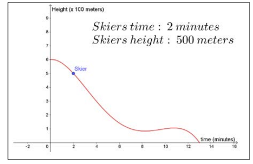
Figure 1: A Skier and its Motion Illustrated by GeoGebra The GeoGebra file is at https://www.geogebra.org/m/wvgukf3c
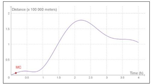
Figure 2: A Motorcycle Driver and its Motion (Measured in Hours) Illustrated by GeoGebra.The GeoGebra file is at https://www.geogebra.org/m/SVDrYnvQ.
Both these applets allow you to move the points. If using these applets, the teacher may facilitate a discussion by moving the blue point labelled skier (representing the skier) or the red point labelled MC (representing the motorcycle) and ask students to explain what change in displacement means. Students should be encouraged to express their ideas in their own words before a formal explanation is provided.
Usually, it is difficult for students to translate the mental image of a skier or a motorcycle into a point on a graph. They should be encouraged to visualize that movement away from the starting point is related to an either a positive velocity upwards or when talking about skiing we might consider the positive movement as downwards. In the motorcycle case it might be the opposite and downwards is related to a negative direction. We measure the displacement of the skier or the motorcycle along the graph and we can ask the students where the skier or the motorcycle has larger or smaller velocity. Since the displacement is not graphed as a straight line, the velocity must be changing over the minutes or over the hours.
If we look carefully at the graphical representation in figure 1a and 1b, we may observe that the skier most likely is going faster in the beginning and then the velocity goes down after 8 minutes and in figure 1b we see that motorcycle is running rather slowly at first since it only covers a distance of 25 kilometres in the first hour. It also appears as if the motorcycle partly turns around and moves back between 25 minutes to 45 minutes after the start of the journey. Thereafter it changes its course once again.
Teachers may ask students to reason about why skier is skiing like this or why the motorcycle’s driver is steering the motorcycle in that way. Let the students suggest probably reasons why the motion is graphed like this. It is naturally to ski the fastest in the beginning and then slow down. Perhaps the motorcycle driver was searching for the correct road. A skier and a motorcycle that is in motion will also have a velocity. How can we view velocity in a distance time graph? What is velocity? Our believe is that students have a general understanding of velocity, perhaps thought of as a measurement of how fast they are able to move from position A to position B. The faster we are moving from position A to position B, the higher is our velocity. At this point of the lesson, it might be suitable to introduce the concept of the slope of the graph and its meaning.
We have spent whole lesson talking and discussing about the interpretation of the two graphs above and we are still unsure if all students understood this the way we wanted. We asked them to discuss in pairs and to relate to their own experiences of displacement and velocity and we discussed the “hill problem” several times. A handful students were still reluctant to adapt the graphical model of displacement and the possibility to see velocity in the model.
For helping the students to visualize the velocity in some way it is important to introduce the concept of slope of a curve at a specific point. Is it likely that the skier is skiing in the same velocity the whole time? What do height mean in figure 1? Is the motorcycle changing its direction at a specific point on the graph in figure 2? How do we translate that into common behaviour when skiing or steering a motorcycle? We can have a rather long discussion with students about where the graphs show different slope at different time and we could discuss what that means in a physical context. Such an example enables us to develop the concept image (Tall et al.]) of slope in the context of graphical representation.
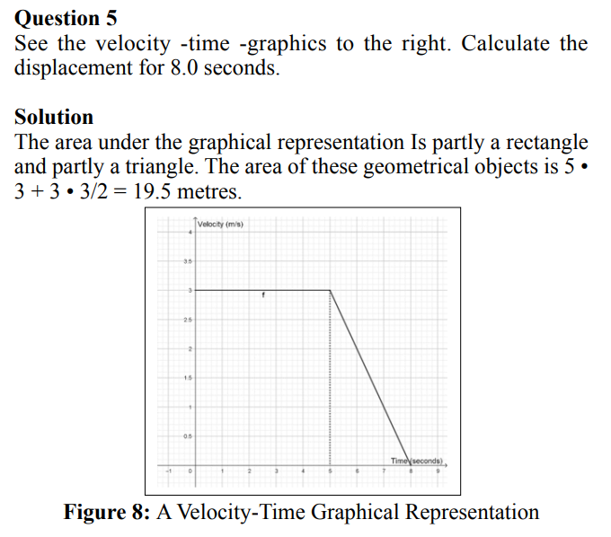
The next lesson could be a more general lesson where we do not care about the origin of the displacement. We just have a displacement of some sort in a uniform motion and the displacement of graphically represented side by side with the velocity. This is a much simpler situation since no skier or motorbike is involved, but at the same time it is a quite more demanding situation since there is a correlated graph of the velocity. See figure 3.
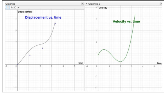
Figure 3: Motion with Displacement and Velocity Illustrated by GeoGebra
You find the GeoGebra file at https://www.geogebra.org/m/rv87gp3j. As we see, the position for both displacement and velocity vs. time is adjustable since we are adjusting the displacement over time by moving one or several of the blue points that are defining the curve to the left. If doing that, you will find that the velocity, with a graphical representation in Graphics 2, will also be changed. Since GeoGebra offers 2 different windows of Graphics this is appropriate to arrange.
All together we consider it important to take this introduction to displacement and velocity rather slow and we used altogether four lessons including to solve different problems from the textbook in physics related to the concepts of displacement and velocity. Perhaps you can do it quicker with your students or perhaps you prefer to do it slower.
Position vs time graphs is an efficient way of visually representing information about the motion of an object in a small space and during a short time.
The vertical y-axis represents the position of the object at a certain time. If we read the value of the graph below (see figure 4) at a particular time we will get the position of the object in meters. As you see, we have attached a point the curve in figure 4 so it is possible to move the point and see the position values at the same time.
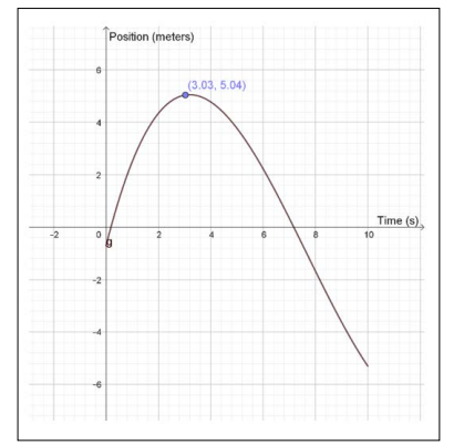
Figure 4: GeoGebra Demonstrate the Position of an Object for 10 Seconds
The correct answer seems to be about 3.8 above the x-axis.
The slope of a position graph represents the velocity of the object. Therefore, the value of the slope at a particular time represents the velocity of the object at that same time.
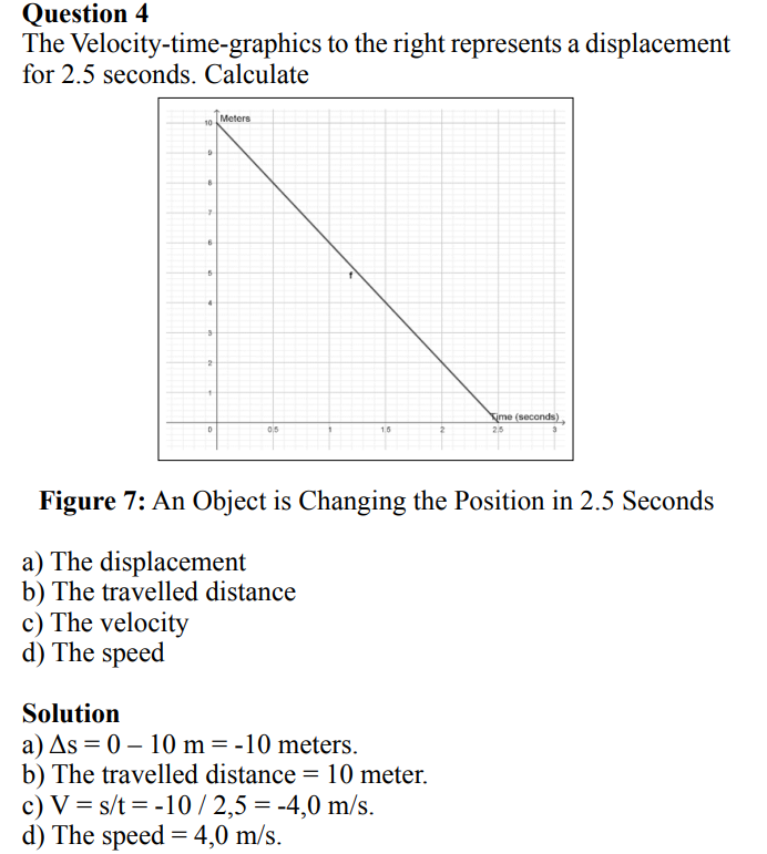
This is also true for a position graph where the slope is changing. For the example graph of position vs. time below, the red line shows you the slope at a particular time. Try sliding the dot below horizontally to see what the slope of the graph looks like for particular moments in time.
Our results are two folded. First, it seemed as if many of the students in the classrooms of physics 1 and physics 2 became interested in the GeoGebra activities. Many of the students downloaded GeoGebra and played with the applets and asked questions. Secondly, the students who were in our class did rather well on the test in physics 1 and in physics 2 compared with general expectations. About 65 % of the students in physics 1 managed to solve two exam questions regarding displacement and velocity. All students in physics 2 managed to solve an extensive exam question about projectile motion.
The overall impression was that the GeoGebra constructions alerted an interest of physics.
Students’ opinions about the GeoGebra constructions were measured with a questionnaire. The students favoured different aspects such as:
a) The possibility to move back and forth with GeoGebra,
b) Good to investigate the connection between displacement and velocity,
c) It is quite fun to learn mathematics and physics with GeoGebra. None of the students expressed negative opinions regarding the GeoGebra demonstrations and laboratory activities. It can be that they consider this as a modern and accurate way of teaching.
We share the questions we used in order to demonstrate Position - Time and Velocity - Time scenarios.
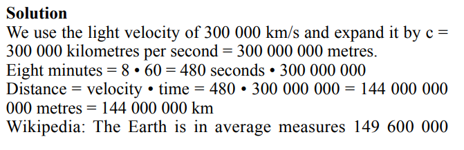
It takes 8 minutes for the light from the sun to reach the earth.
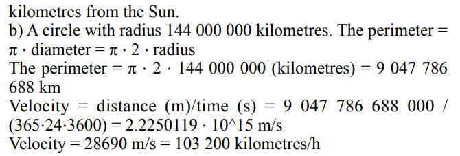
a. What is the distance between the Earth and the Sun?
b. What velocity do the Earth have around the Sun?
Thomas and Güner goes to the grocery store independently. See the figure below. Thomas is described in the blue curve while Güner is described in the red curve.
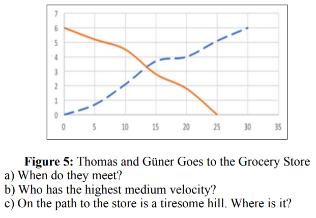
a) After about 13 minutes.
b) Thomas has moved 6 kilometres under 30 minutes and Güner has moved 6 kilometres under 25 minutes. Güner has the highest medium velocity.
c) The velocity becomes lower between 15 and 20 minutes for both Thomas and Güner. About 4 km from Thomas and 3 km from Güner‘s starting positions. The tiresome hill is probably there.
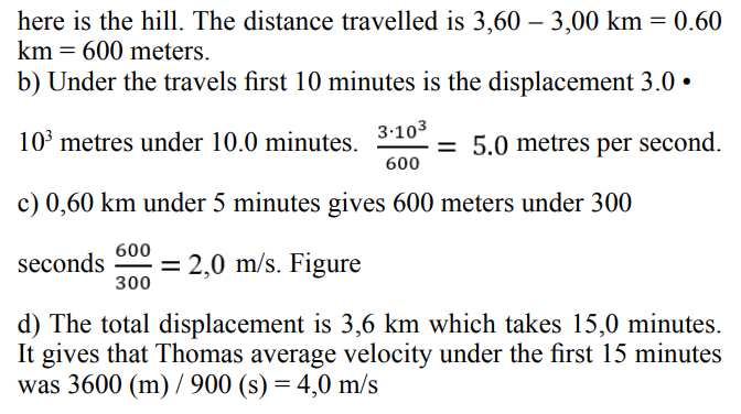
Thomas goes out for a bicycling tour. Part of the tour is on smooth ground; other part is on hilly ground. See the position- time graphics beneath to the right.
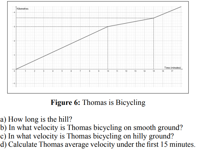
a) The slope of the position-time-graphics gives the velocity. Under a part of the distance travelled is the slope less than before:
1.Frigg R (2006) Scientific Representation and the Semantic View of Theories. THEORIA. An International Journal for Theory, History and Foundations of Science 21: 49-65.
2.Friel SN, Curcio FR, Bright GW (2001) Making sense of graphs: critical factors influencing comprehension and instructional implications. Journal for Research in Mathematics Education 32: 124-158.
3.Kohl B (2001) Towards an Understanding of how Students Use Representations in Physics Problem Solving. PhD thesis at University of Colorado. https://www.colorado.edu/per/sites/default/files/attached-files/pk_thesis_0.pdf
4.Leinhardt G, Zaslavsky O, Stein MM (1990) Functions, graphs, and graphing: Tasks, learning and teaching. Review of Educational Research 60: 1-64.
5.Thomas Lingefjärd, Farahani D (2017) The Elusive Slope. International Journal for Science and Mathematics Education 16: 1187-1206.
6.Ainsworth S, Bibby P, Wood D (1997) Information technology and multiple representations: new opportunities - new problems. Journal of Information for Teacher Education 6: 93-104.
7.Thompson P (1994) Images of rate and operational understanding of the fundamental theorem of calculus. Educational Studies of Mathematics 26: 229-274.
View PDF